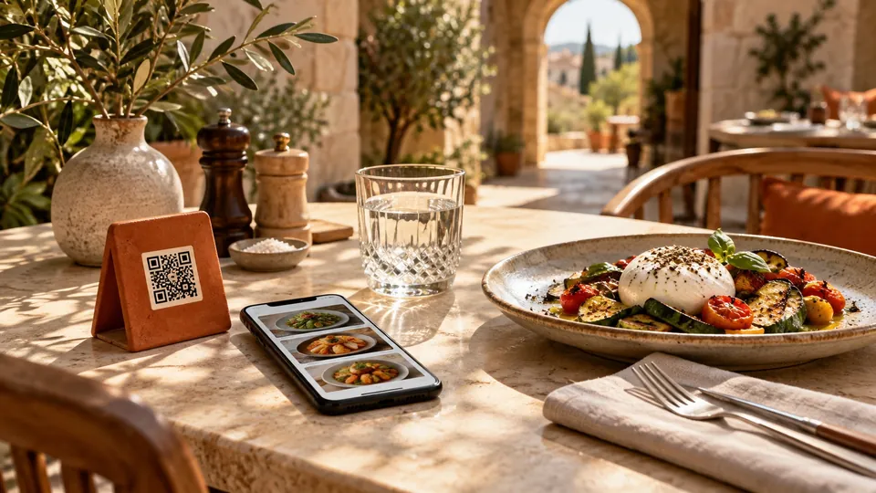
A guest sits down, moves a water glass, and scans the small code beside the cutlery. What happens next matters more than the code itself. Can they find something they want? Can they understand the price and portion? Do they know how to tell your team what they have chosen?
A useful QR menu answers those questions without taking over the meal. For restaurants, cafés and lounges, the aim is a clear route from arriving to choosing. The technology should feel like a small convenience, with the venue's food and hospitality doing the memorable work.
Start with what a QR menu actually does
A QR code opens a destination. That destination might be a PDF, a web page, or an ordering system. Scanning alone does not tell guests which experience they are about to get.
A web-based digital menu presents dishes and drinks as readable content that can adapt to a phone. Depending on the product, it may include photographs, categories, search and a list of selected items. Ordering and payment are separate capabilities. A venue should describe them only when they are available and connected to its service process.
This distinction belongs in the guest experience. If a list is there to help someone remember their choices, say that they should show it to a member of staff. If an order is sent, guests need a clear confirmation and your team needs a reliable way to receive it.
Make the first screen earn its space
Your logo and venue name reassure guests that they have opened the right menu. After that, the first screen should help them start choosing. A long welcome message, several promotions and a large decorative image can push the actual food out of view.
Put the most useful categories close to the top. Use names guests recognise: small plates, mains, coffee, desserts. A playful heading can add personality, but it should not require a staff explanation. If a menu changes between breakfast and dinner, make the active service obvious.
The right opening screen varies by venue. A short coffee menu may need very little navigation. A restaurant with several courses benefits from clear sections. A lounge may need equally visible routes to drinks, food and options without alcohol. Organise around the decisions people make at the table.
Give each dish enough information to choose
A strong menu entry needs a recognisable name, a useful description and an unambiguous price. Where it matters, add portion or serving information. A sharing dish should explain what is being shared, rather than leaving guests to estimate from a photograph.
Consider an illustrative entry: "Roasted squash, whipped feta and toasted seeds. A small plate to share or order alongside a main." That description explains ingredients, texture and the place of the dish in a meal. It is more useful than several lines of praise.
Photographs should resemble what the kitchen serves. A good image can answer questions about presentation and portion, but it should not substitute for written information. Check that prices, descriptions and availability agree across the menu and with the staff taking orders.
Let guests narrow the choice
Categories help people explore. Search helps someone who already knows what they want. Dietary filters can help guests find relevant information, provided the underlying labels are accurate and maintained.
Do not make every filter equally prominent. Start with the controls that serve your menu, then place more detailed choices behind a clearly named filter button. Guests should be able to tell when a filter is active and clear it without starting again.
An empty result also needs an explanation. "No dishes match these filters" is more helpful than a blank screen. Dietary preferences and food allergies require different care: a filter is a browsing aid, and allergy questions still need the venue's verified information and an appropriate conversation with staff.
Check it in the room where it will be used
An attractive menu on an office monitor can be awkward at a small table. Open it on ordinary phones in the dining room. Try it by the window, in a darker corner and during the lighting setup used for evening service.
Can you read descriptions without pinching the screen? Can you tap a category without hitting its neighbour? Does a photo reveal its subject in the small card? Does opening and closing a dish return you to a useful place?
Readable contrast is part of this work. W3C's accessibility guidance specifies a minimum contrast ratio of 4.5:1 for ordinary text, with defined exceptions including larger text. Dark mode alone does not establish readability. Check the actual text and background colours. W3C contrast guidance.
Keep hospitality in the loop
A QR menu should sit comfortably beside a greeting and an offer of help. Keep an alternative available for someone without a suitable phone, with a low battery, or who simply prefers another way to read the menu.
Brief staff on the exact guest journey. One sentence can prevent confusion: "You can browse on your phone and show me your choices when you're ready." Make sure that sentence matches what the screen actually does.
For a closer look at how dishes, categories and photographs can fit together, explore the Qarc template. Bring your own menu to that comparison. The useful question is whether a guest can reach a confident choice with less explanation from your team.